Okay, okay. This isn’t actually about a Nelly video from 2002. It’s actually about one of the coolest web tools ever: Heat maps!
A heat map is an analytical tool for you to find out information about how your visitors are actually using your website. You can see a visual representation of information such as how far down people are scrolling and what they are clicking on. This can help you improve your website’s usability based on how users are actually using it.
For example, perhaps you have an icon that looks like a clickable link but it isn’t– you would be able to tell so that you could change the icon so that it no longer looks like a link and therefore isn’t confusing your users.
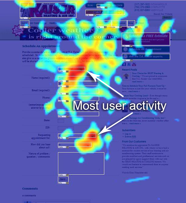
Here is an example of a heat map:

Image from http://provim.net/heat-maps/
The brighter (warmer) the color, the more users hovered their mouse over that area, which is proven method of tracking eye movement.
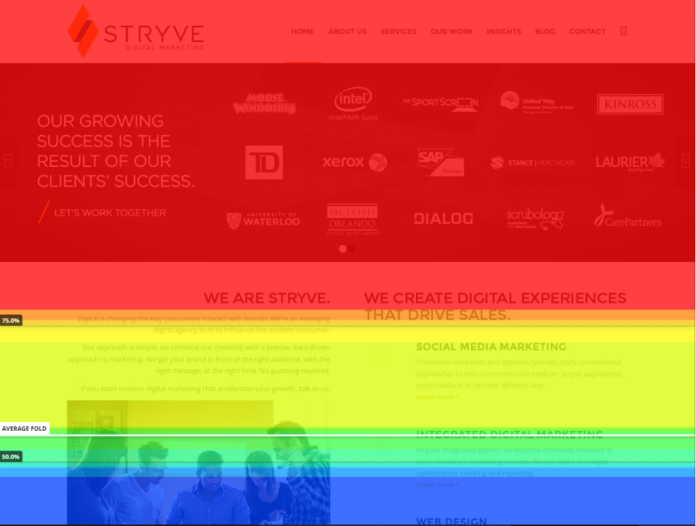
Here is another type of heat map that tracks scrolling so that you can see how far your visitors scroll down the page.

Photo Credit: http://stryvemarketing.com/
